Mobile App Design · User Experience Design · User Interface Design
MyFitnessPal
A conceptual redesign that brings nutrition data to the front of the app and gives the social experience a home of its own.
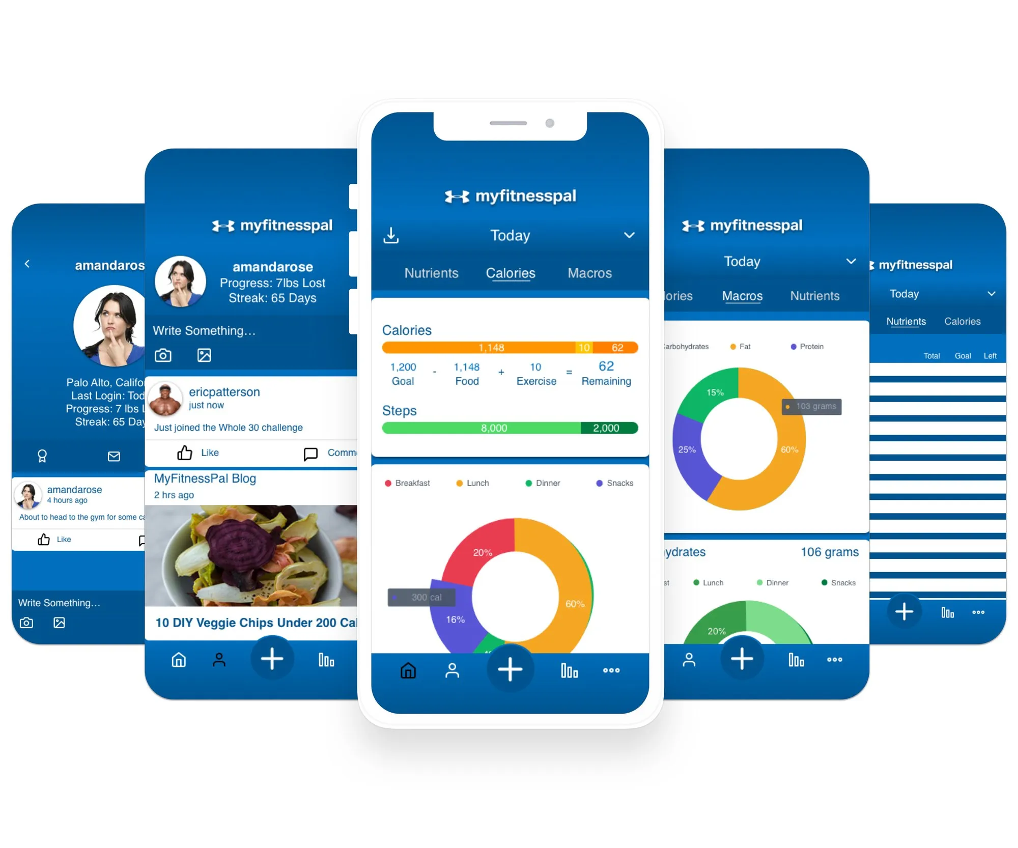
Design brief
Objective
Create a better social experience and a more accessible display of nutritional information for MyFitnessPal mobile users.
Product
MyFitnessPal is a mobile app and website for tracking weight, nutrition and exercise.
Problem
Many great features are hidden by poor information architecture.
- Nutritional tracking tools are buried in the diary
- The social experience is hidden in the More tab and hard to navigate
Solution
Bring nutritional data visualizations to the front page and give the social experience its own tab.
Scope
The product varies by channel. This project focuses on the nutrition and social experiences of the iOS app.
Identifying users
To decide which features to improve, I researched the different types of MyFitnessPal users. I surveyed current users about how and why they use the app, then grouped them by their responses.
User archetypes
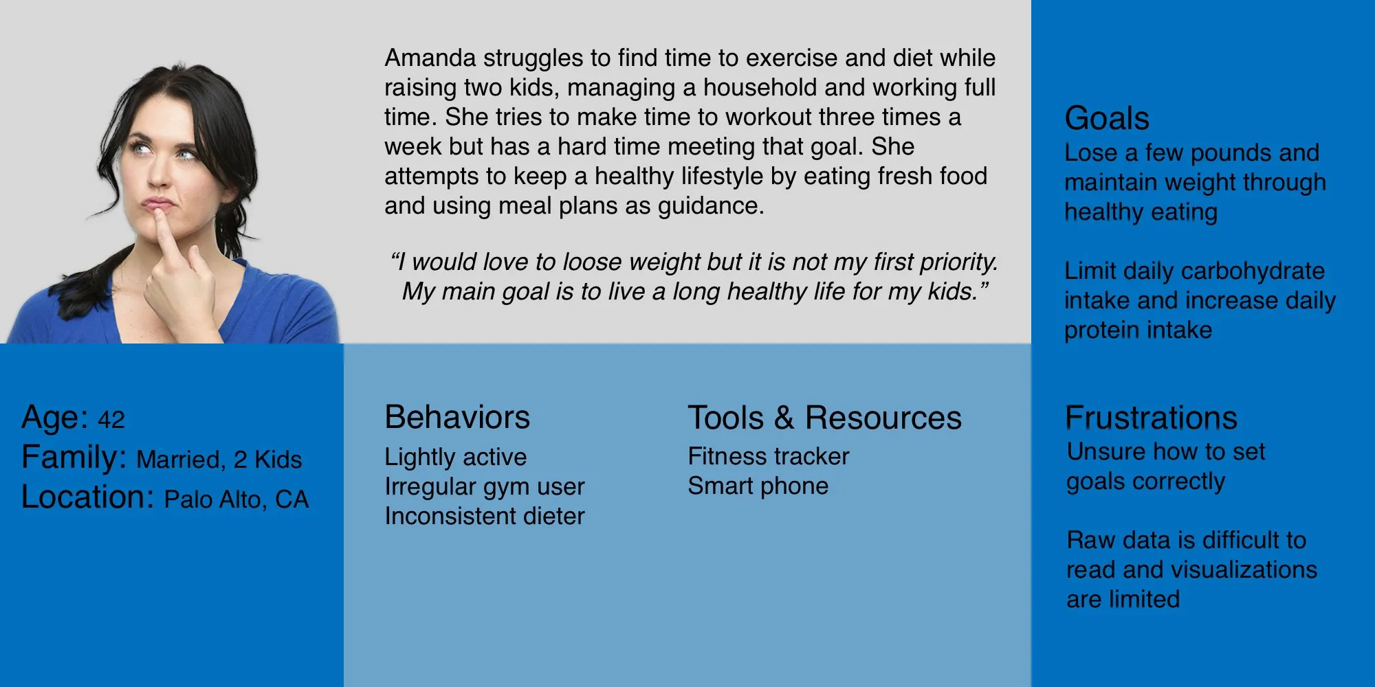
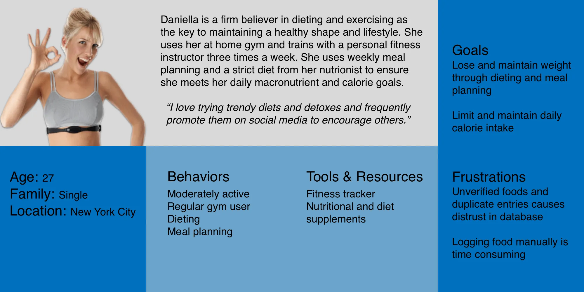
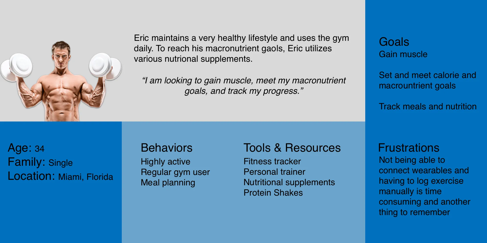
I created three archetypes to define the different kinds of mobile users.

The Exerciser is looking to gain or lose weight. Their primary goal is tracking progress and exercise.

The Dieter wants to lose weight and is motivated to put in the effort. They mainly track progress and nutrition.

The Attempter is the average user: not always consistent, and looking for motivation to reach their goals.
User personas
I created a persona for each archetype to put a face to the people I was designing for. Amanda was the primary persona for this project.
Defining problems
With Amanda in mind, I did an extensive teardown of the existing iOS app and identified the main problems and possible solutions.
Discovery
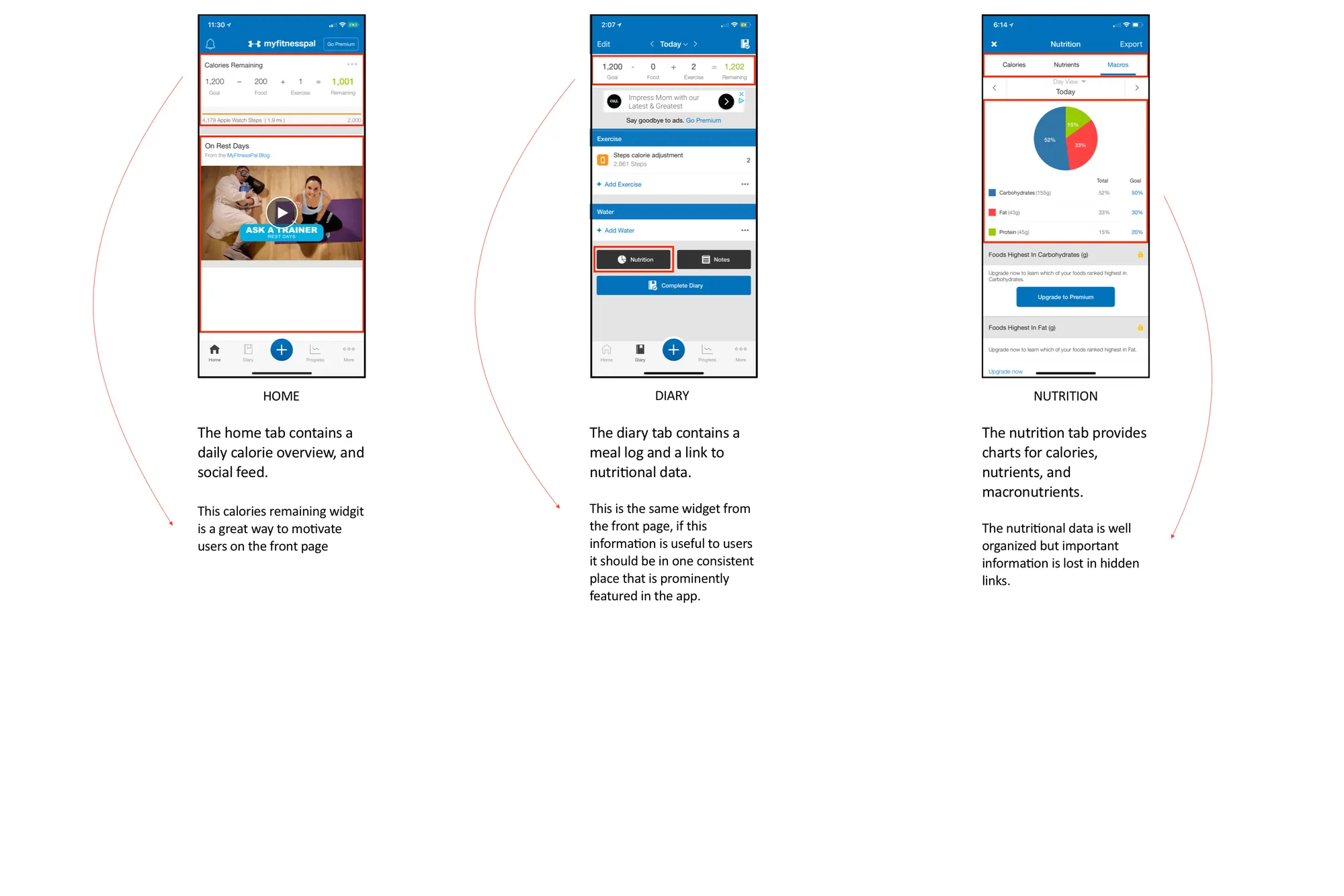
Nutrition experience
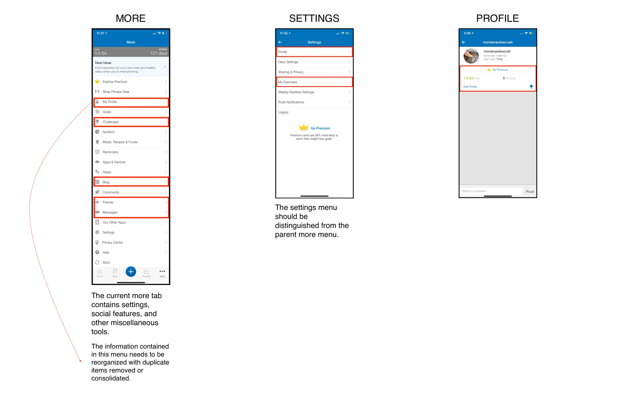
Social experience
Remote usability testing
Three participants completed six tasks covering the nutrition and social features:
- View your protein consumption for today’s breakfast
- Check what percentage of today’s calories was eaten at lunch
- View today’s calcium intake and increase the goal to 150%
- Update your profile picture
- Post a progress picture to the newsfeed
- View your achievements and join a new challenge
Problems & possible solutions
Nutrition tools are hidden in the diary. A front page featuring the most-used features, like the diary and data visualizations, will encourage users to track their health and nutrition regularly.
The social experience is hidden in the More tab. A dedicated social tab brings the feed and the social features scattered across the app into one central, easy-to-reach place.
Initial ideas
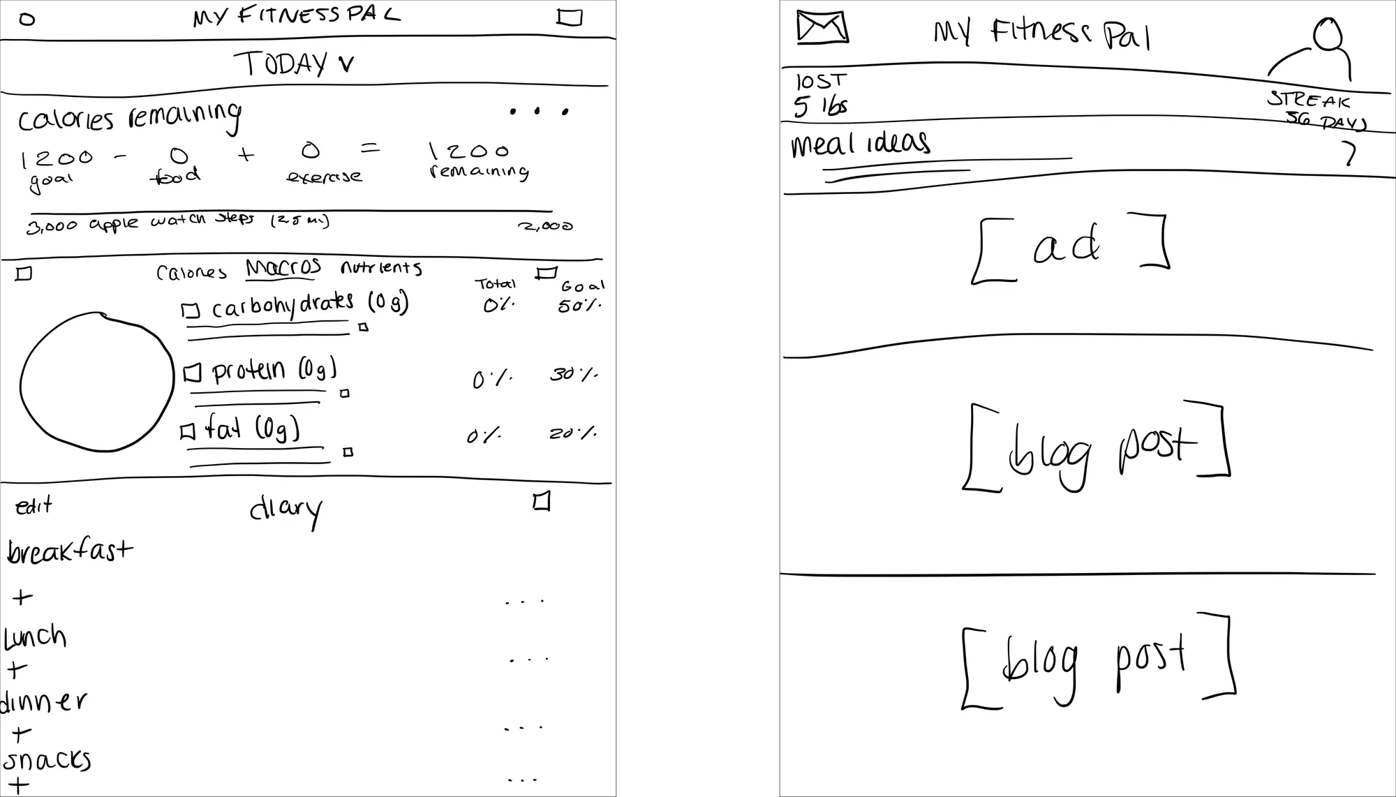
Lo-fi wireframes
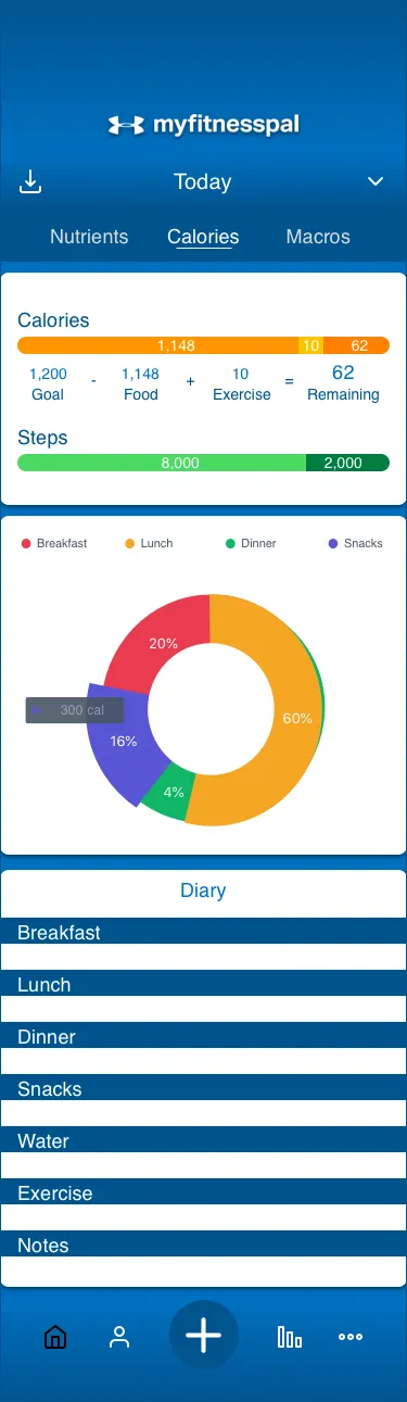
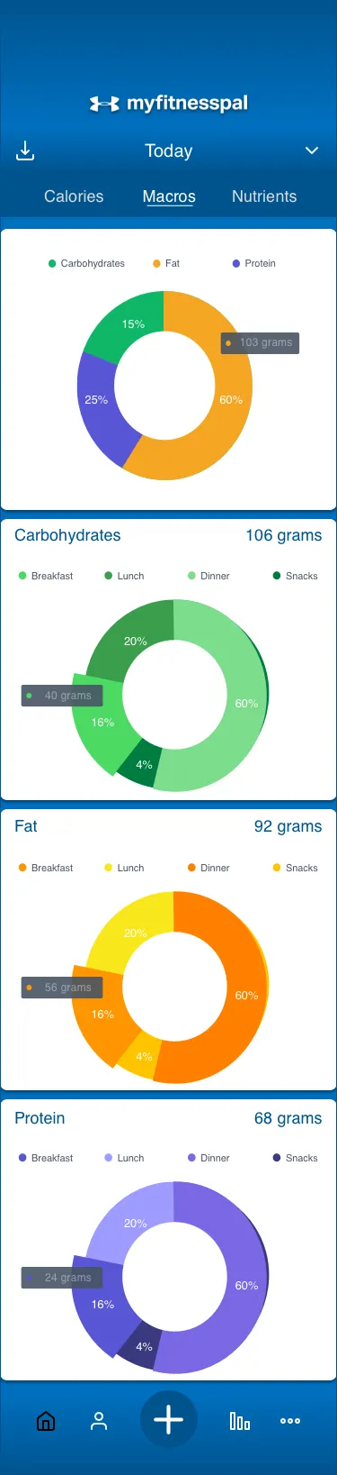
Home. The most-used nutrition features become interactive modules: calories, diary, macros and nutrients, each swipeable to see a breakdown by meal. A date picker at the top lets users view and edit any day.
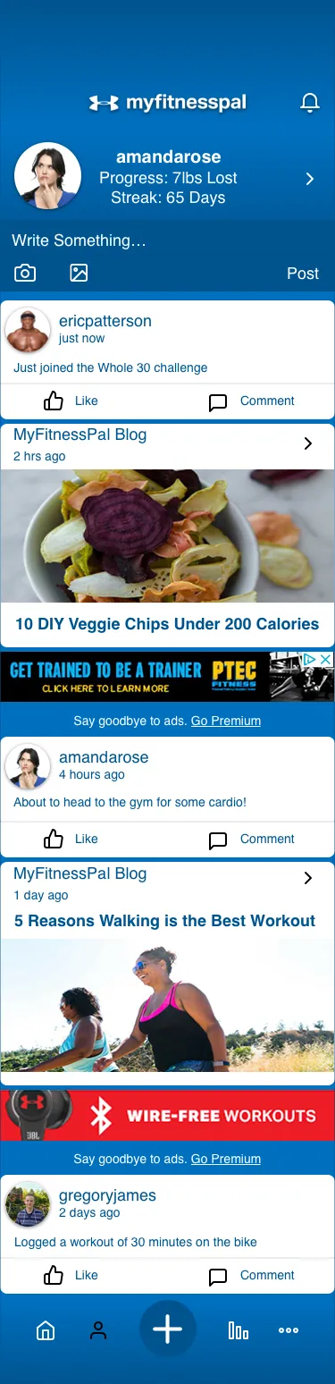
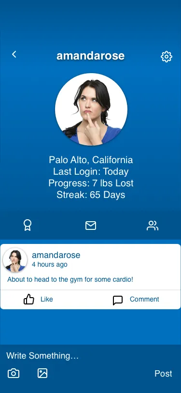
Social. A central hub for every social and motivational feature: a profile preview with progress and streak, a feed of blog and user posts, and quick links to messages, friends, challenges and awards.
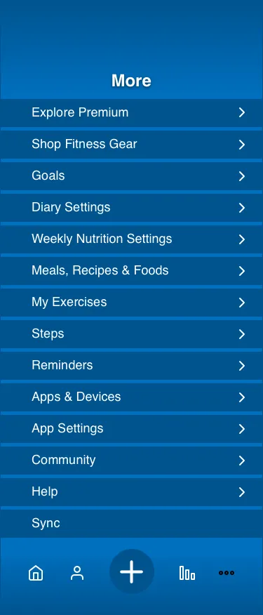
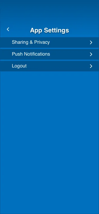
More. Social features moved out into the new tab. My Exercises moved up from App Settings, and Apps & Devices merged with Our Other Apps.
User testing
A/B testing
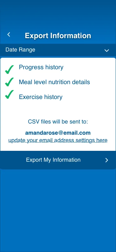
I tested a lo-fi prototype of the current app against a lo-fi prototype of the redesign. Users completed three tasks: view and export nutritional data, view achievements and join a challenge, and edit their profile.
Visual design
Design iterations
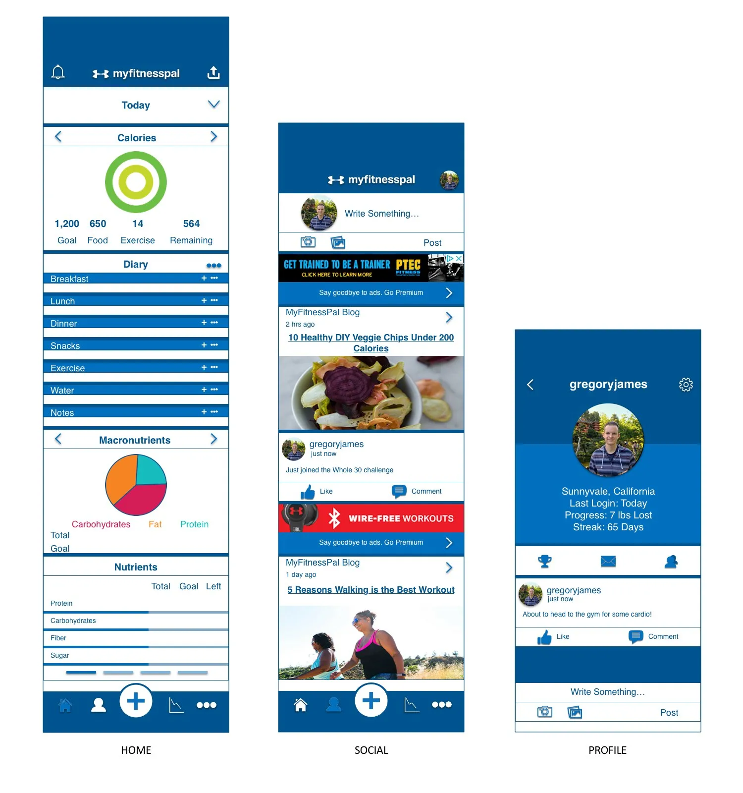
Consolidated the export icons into a single export action in the navigation bar, and swapped the social feed’s profile icon for a profile photo so it no longer looked like a tab.
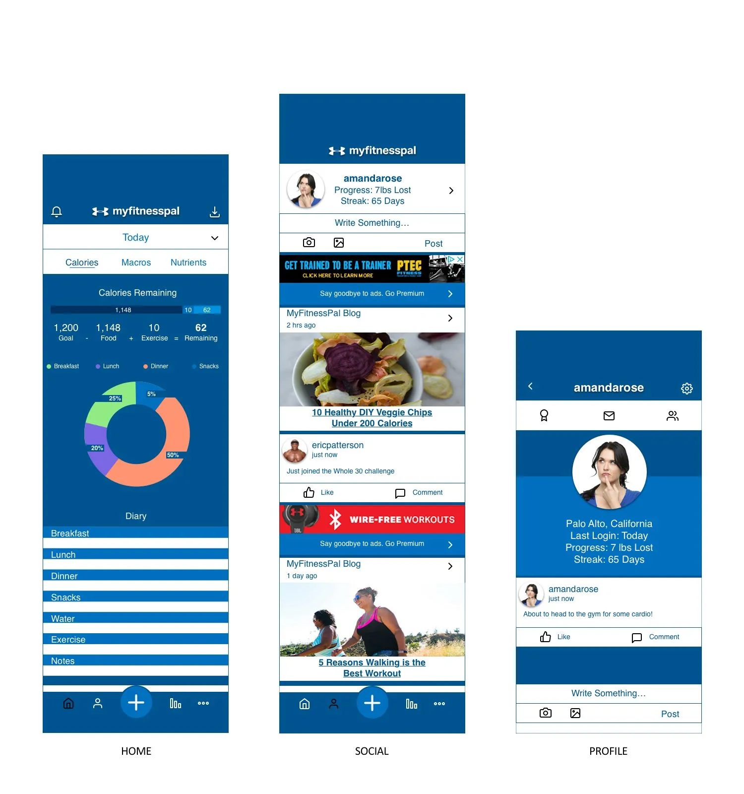
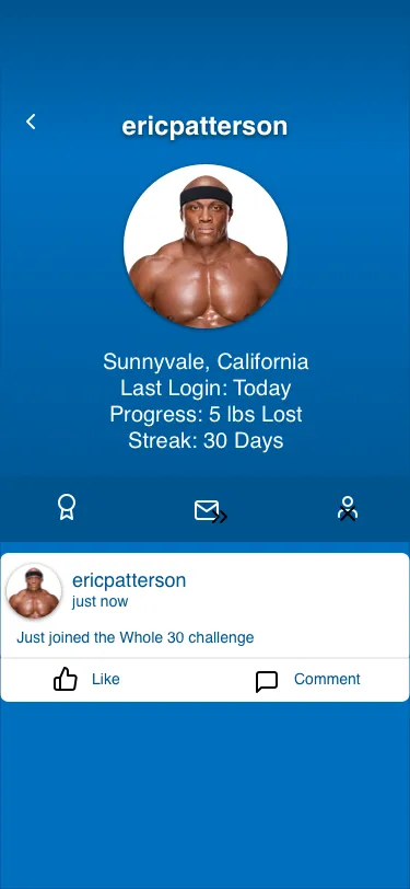
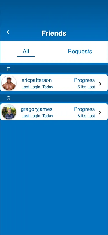
Made user and friend profiles consistent, so you see your profile the way a visitor would. Renamed lbs lost to Progress to fit different goals.
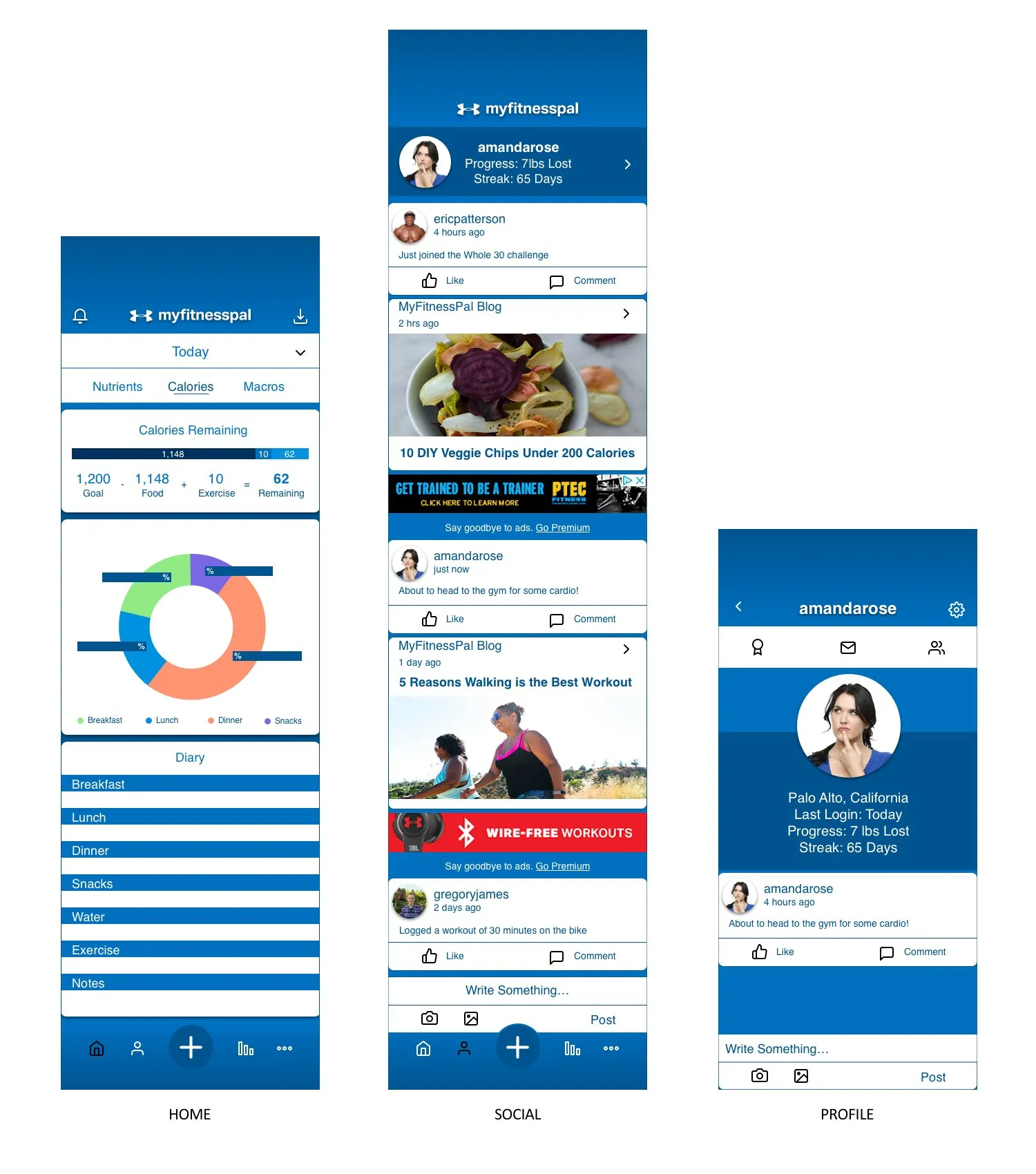
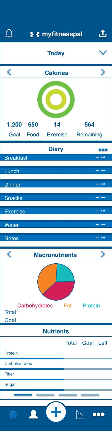
With the UX settled, I moved to the UI: clean but bold, with rounded content boxes and gradients for a lighter, more open feel.
Final product
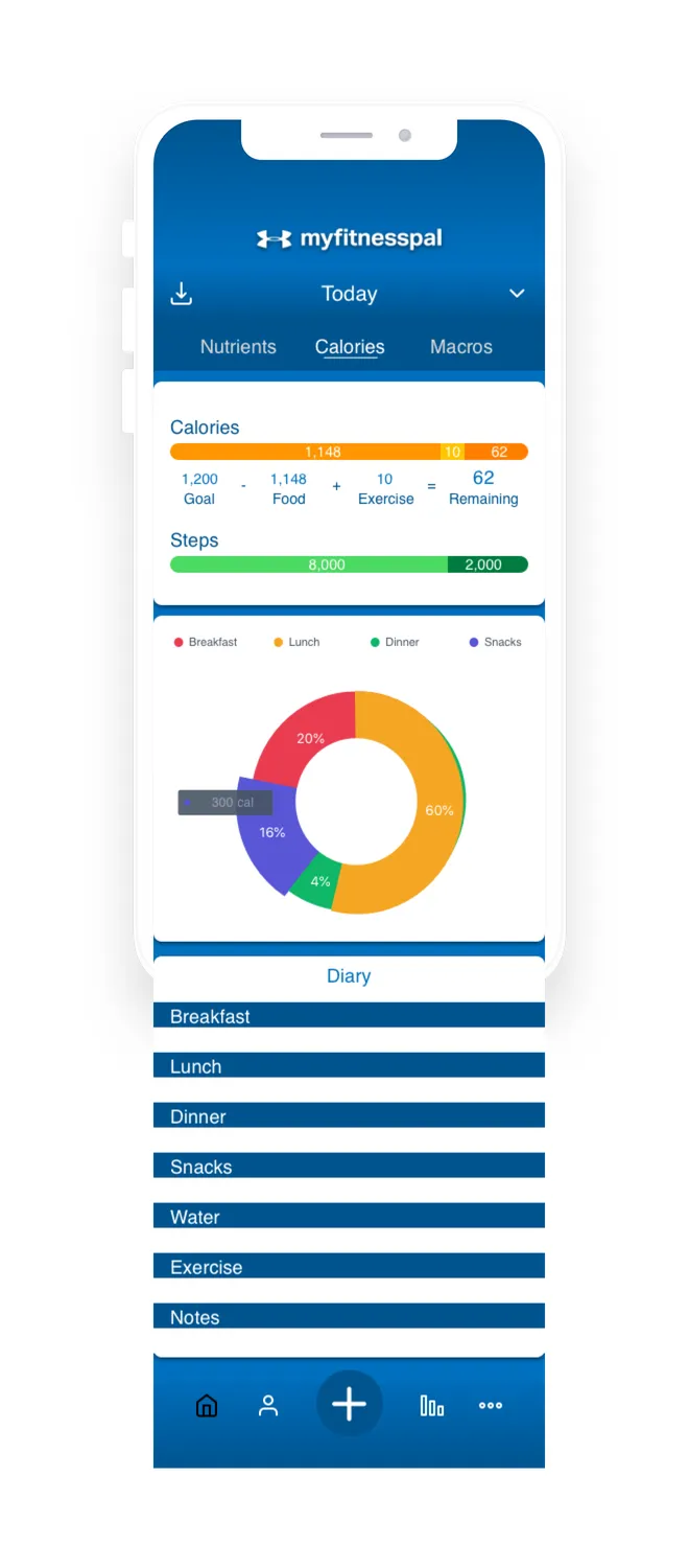
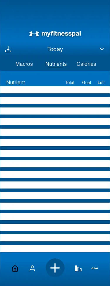
Home. A detailed, easy-to-navigate nutrition experience. Pick any day from the Today menu; Calories shows goal progress, calories by meal and the diary; Macronutrients charts carbs, protein and fat by meal; Nutrients lists daily intake against goals.
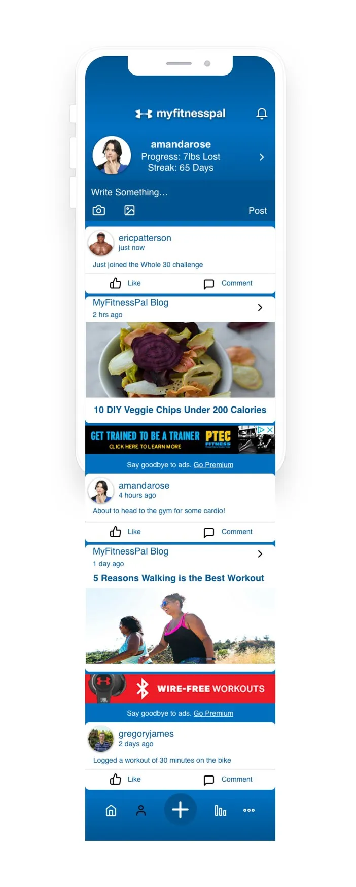
Social. The feed, profile, friends, messages, challenges and achievements, all in one place that’s easy to reach.
High-fidelity screens