Mobile App Design · User Experience Design · User Interface Design
medkit
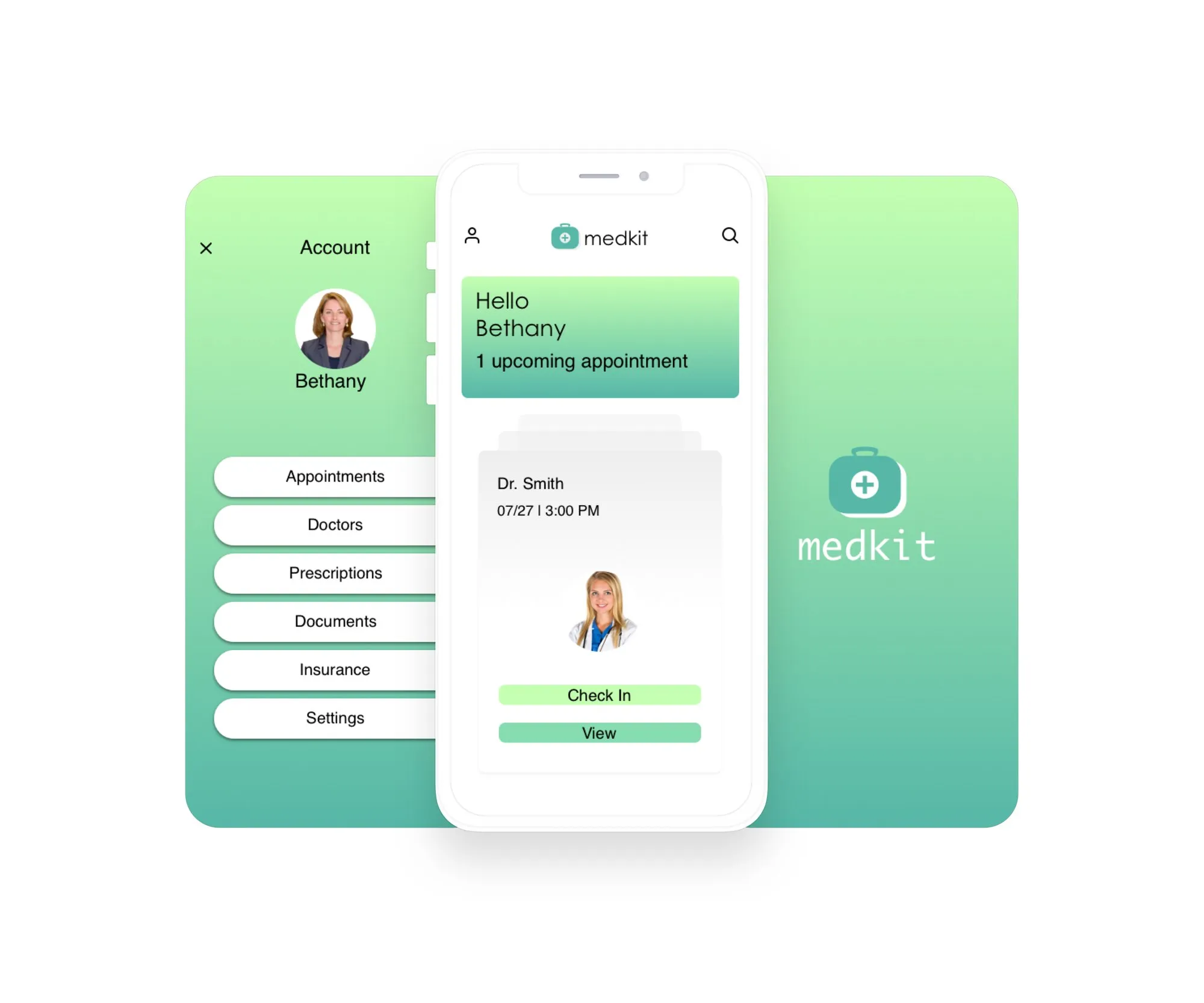
An original app that lets patients schedule medical appointments and fill out check-in forms from their phone.
Design brief
Objective
Create an app that lets patients easily schedule medical appointments and fill out check-in forms on mobile.
Product
medkit lets users schedule medical appointments, fill out check-in forms and manage their medical data.
Problem
Scheduling doctor appointments and filling out check-in forms at the office is a waste of time.
Solution
One app for finding physicians, scheduling appointments, filling out forms, storing and sending medical documents, and requesting prescription refills.
Scope
This case study focuses on the check-in flow for an existing user: the steps to check in to a previously scheduled appointment.
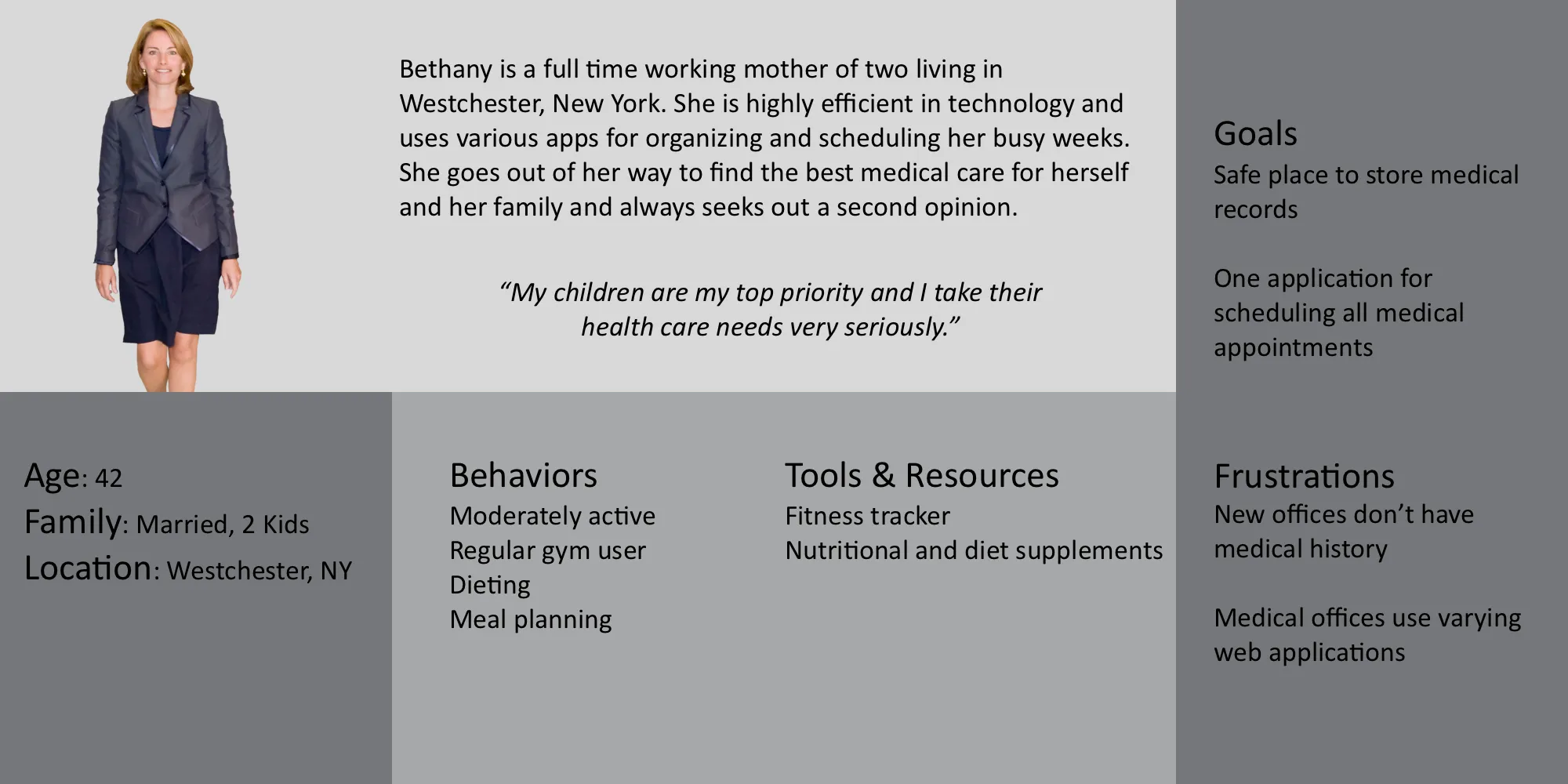
User persona
Initial ideas
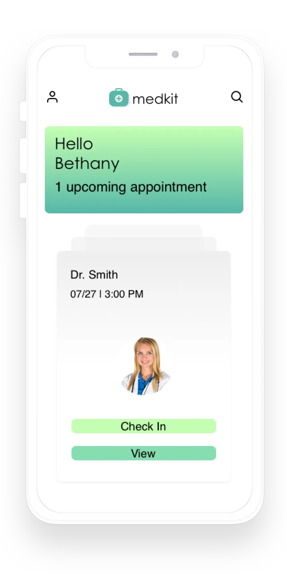
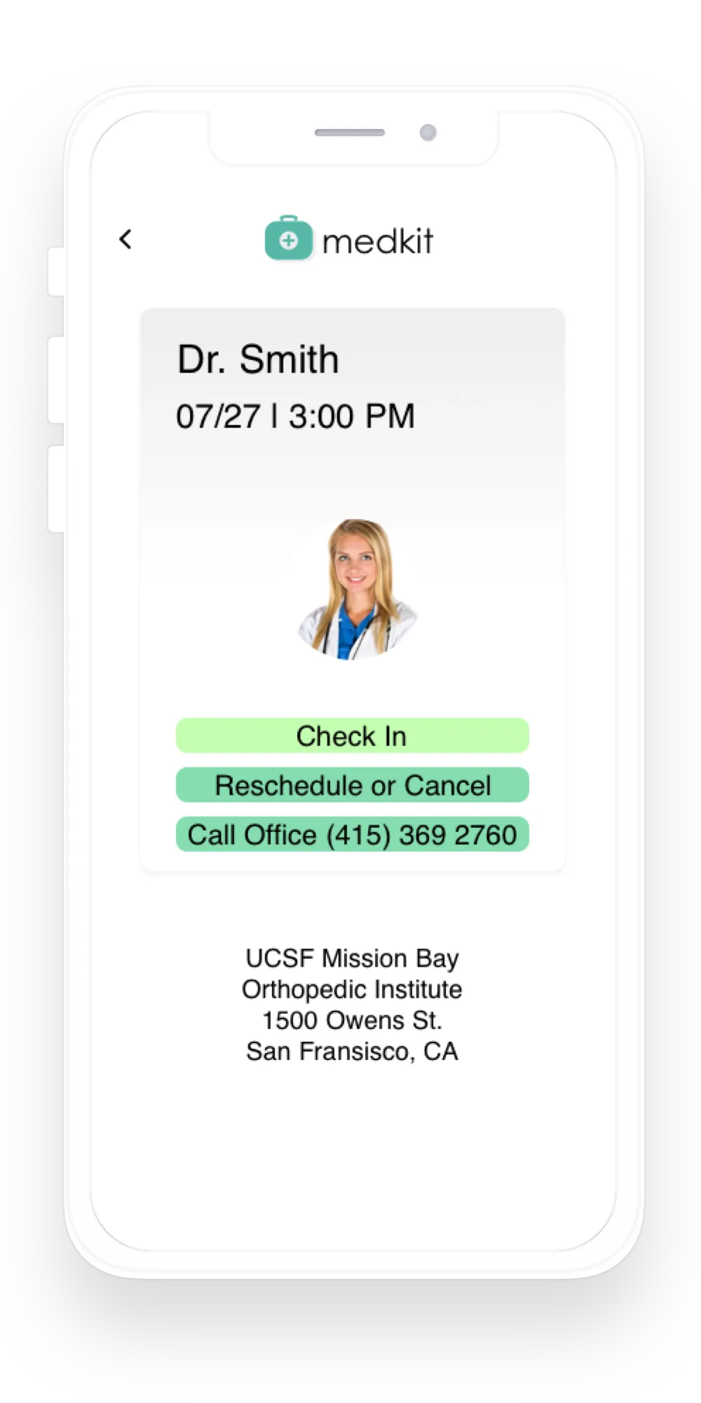
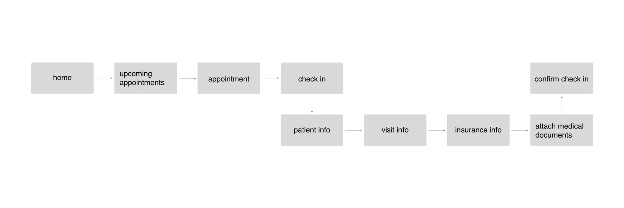
The user flow shows the path a user takes to check in to a scheduled appointment. From the home screen, they go to upcoming appointments, where they can view details, call the office or check in. Checking in lets them fill out arrival forms on their phone before they get to the office. The forms are sent to the medical office and the check-in is confirmed with a message.
Task flow
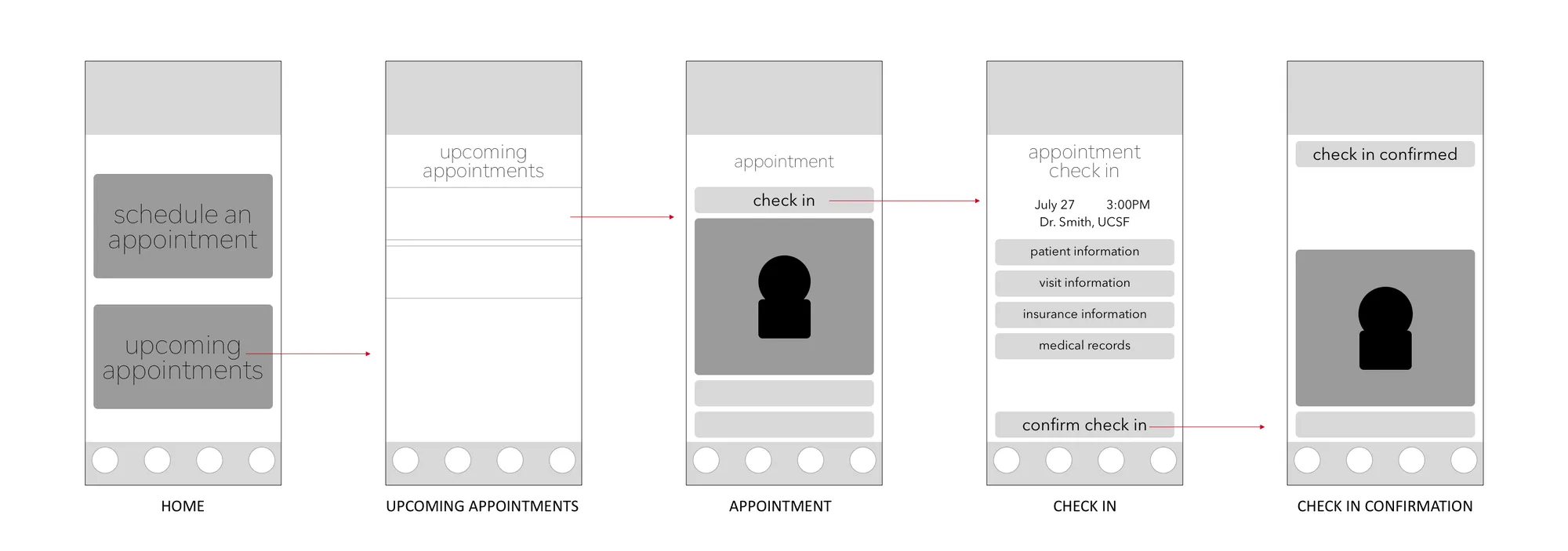
Low-fidelity wireflow
Design iterations
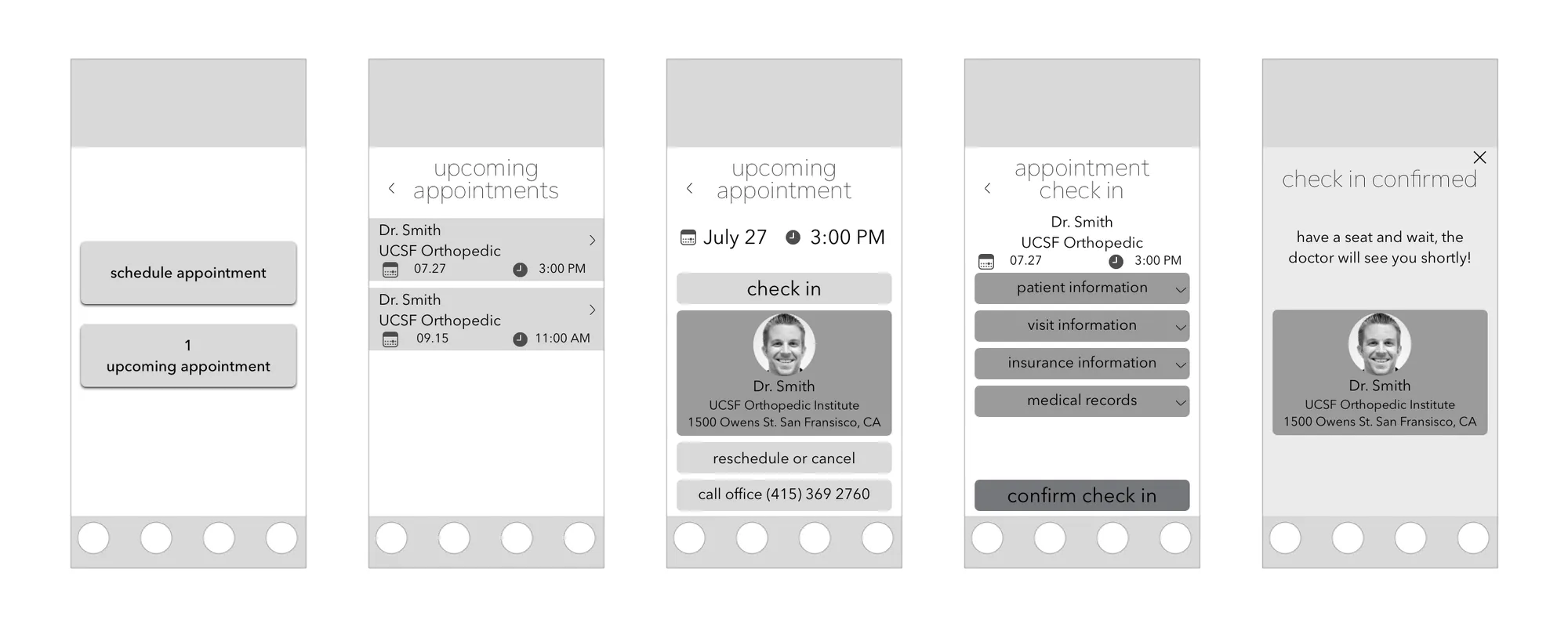
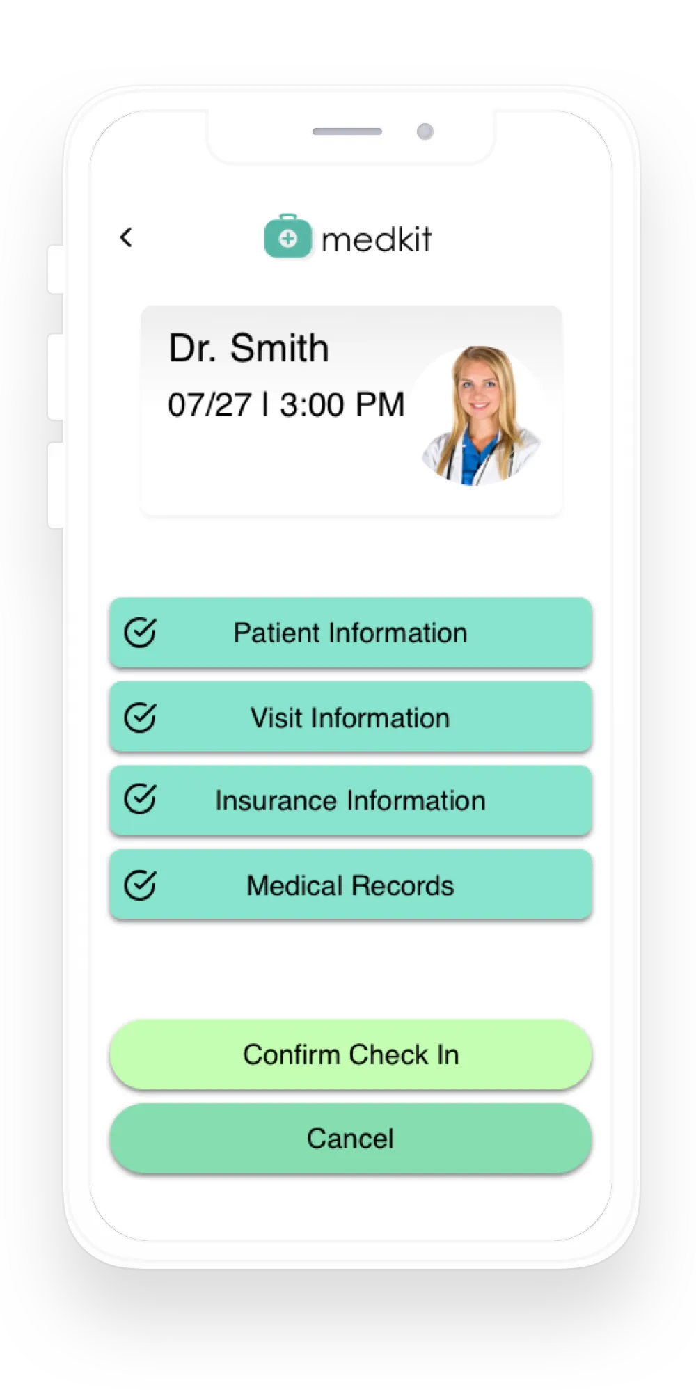
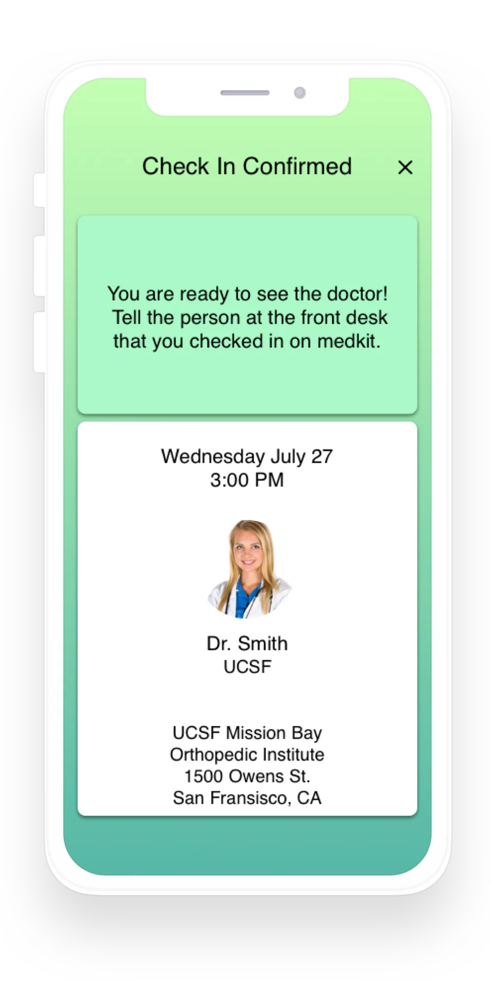
I used drop-down menus in the check-in flow instead of links to other pages, so users can go back and change a section without leaving the page or re-entering information. I also designed a friendly confirmation page with instructions for the patient.
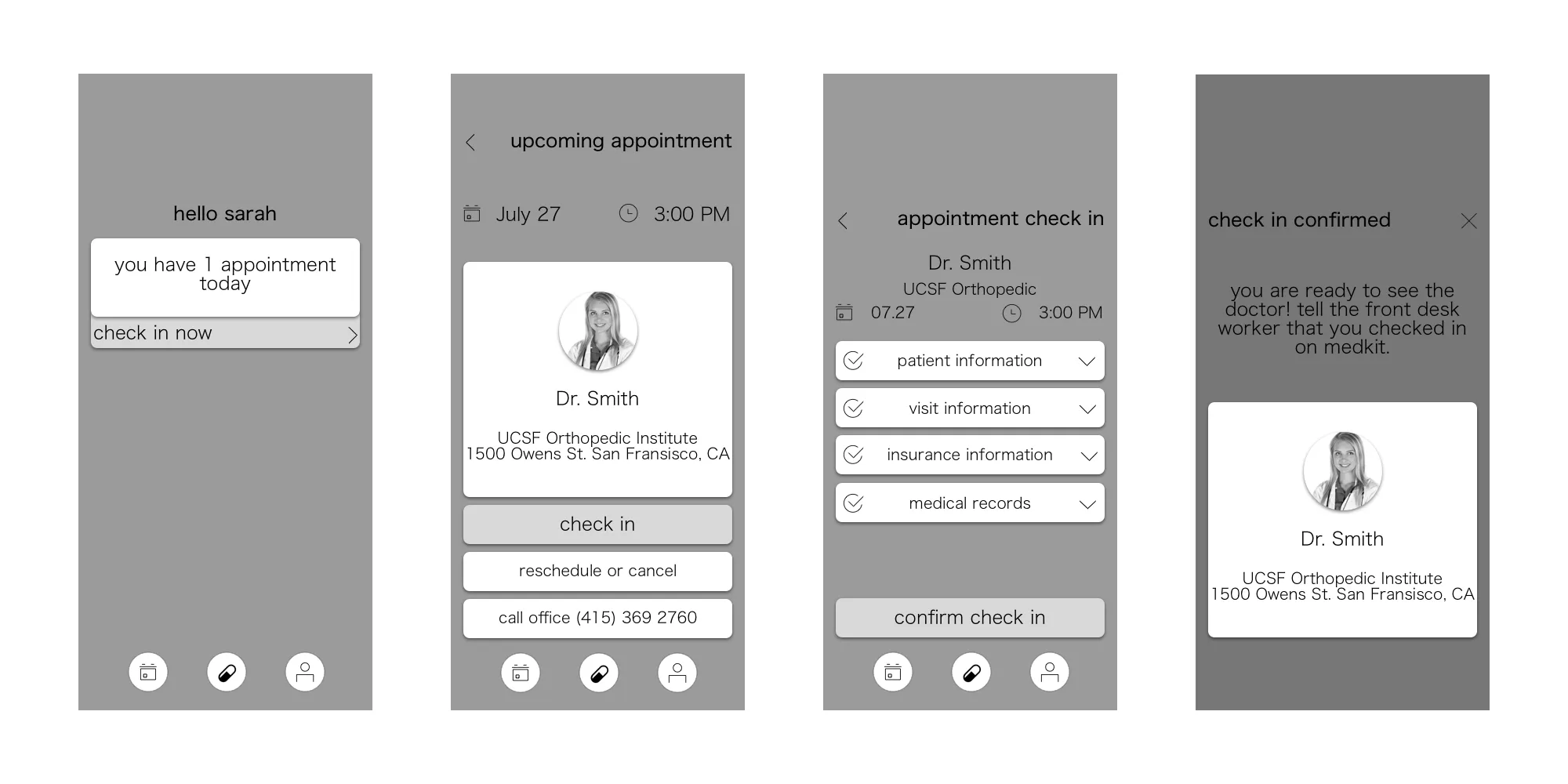
After testing a paper prototype, I added direct links on the home screen to upcoming appointments that are ready for check-in. I moved the check-in button down with the other buttons and used color to show which action matters most.
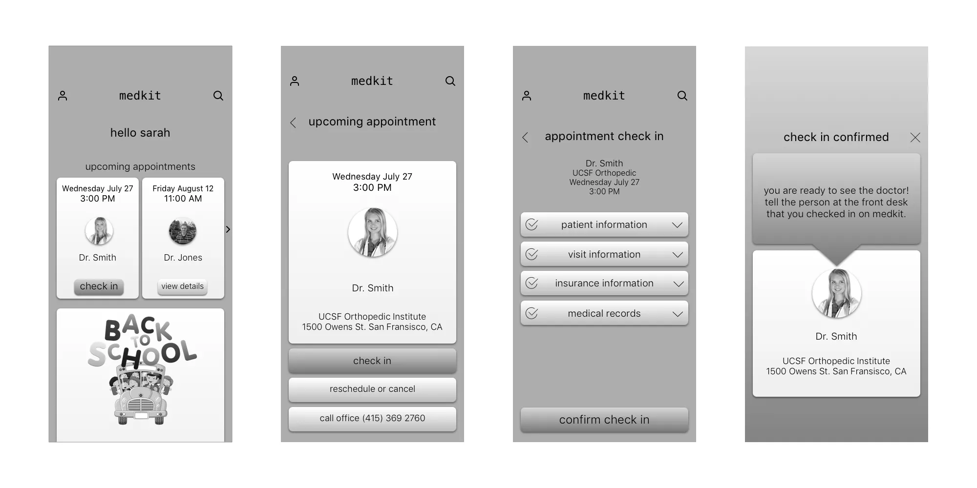
I added icons to the check-in form to show which sections are complete and which fields are selected. Icons, not just color, keep this clear for every user.
Final product