User Experience Design · User Interface Design · Web Design
Bed Bath & Beyond
A conceptual redesign of the Bed Bath & Beyond website that simplifies the bedding category and makes browsing more visual.
View prototype ↗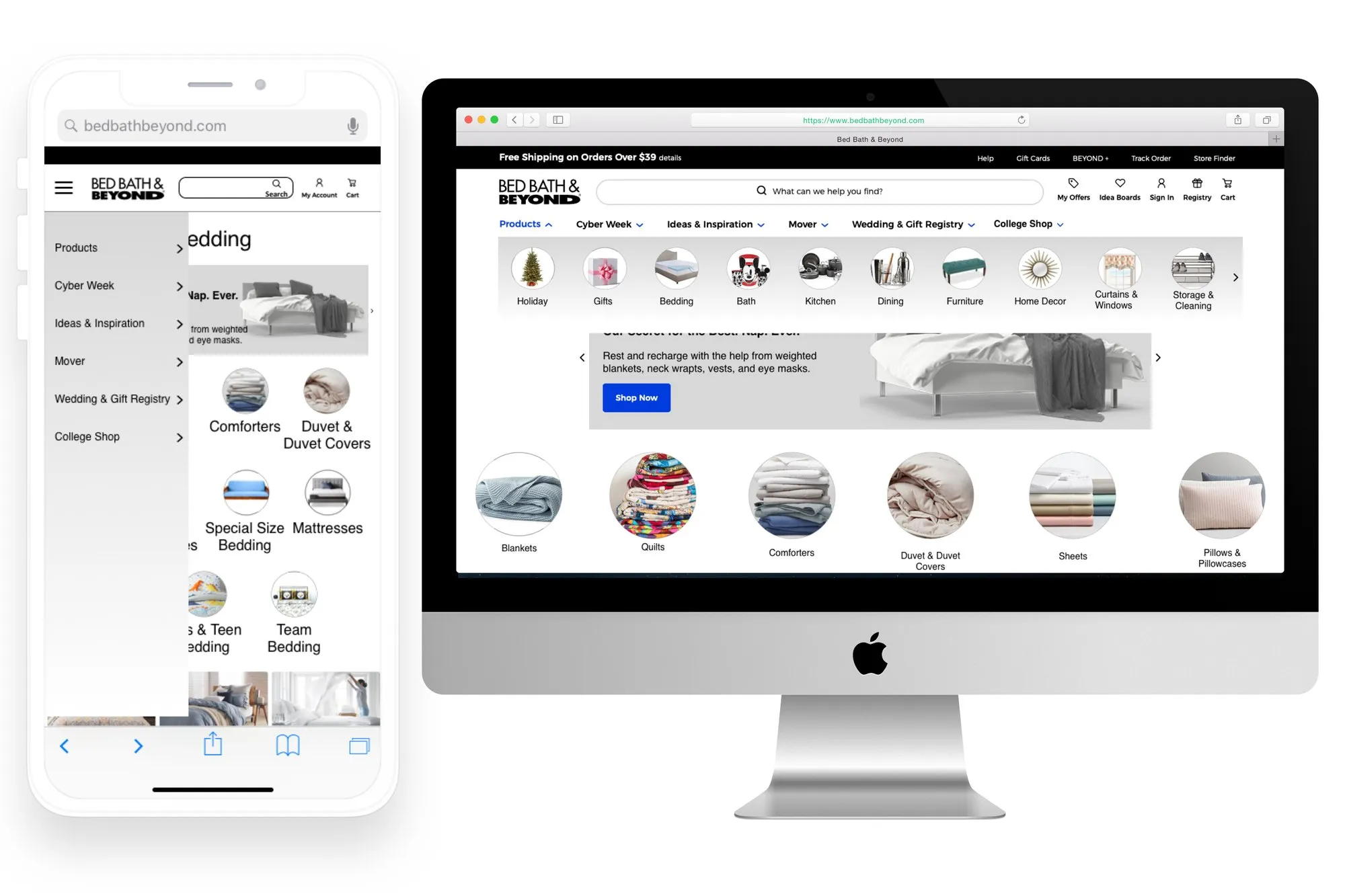
Design brief
Objective
Improve the information architecture and visual navigation of the Bed Bath & Beyond website.
Product
Bed Bath & Beyond sold home goods, mainly for the bedroom and bathroom, plus the kitchen and dining room.
Problem
Poor information architecture and a busy navigation leave shoppers feeling overwhelmed.
Solution
Use usability testing to find problems in the bedding category, then restructure its information architecture to fix them.
Scope
The information architecture and navigation of the bedding category and its subcategories.
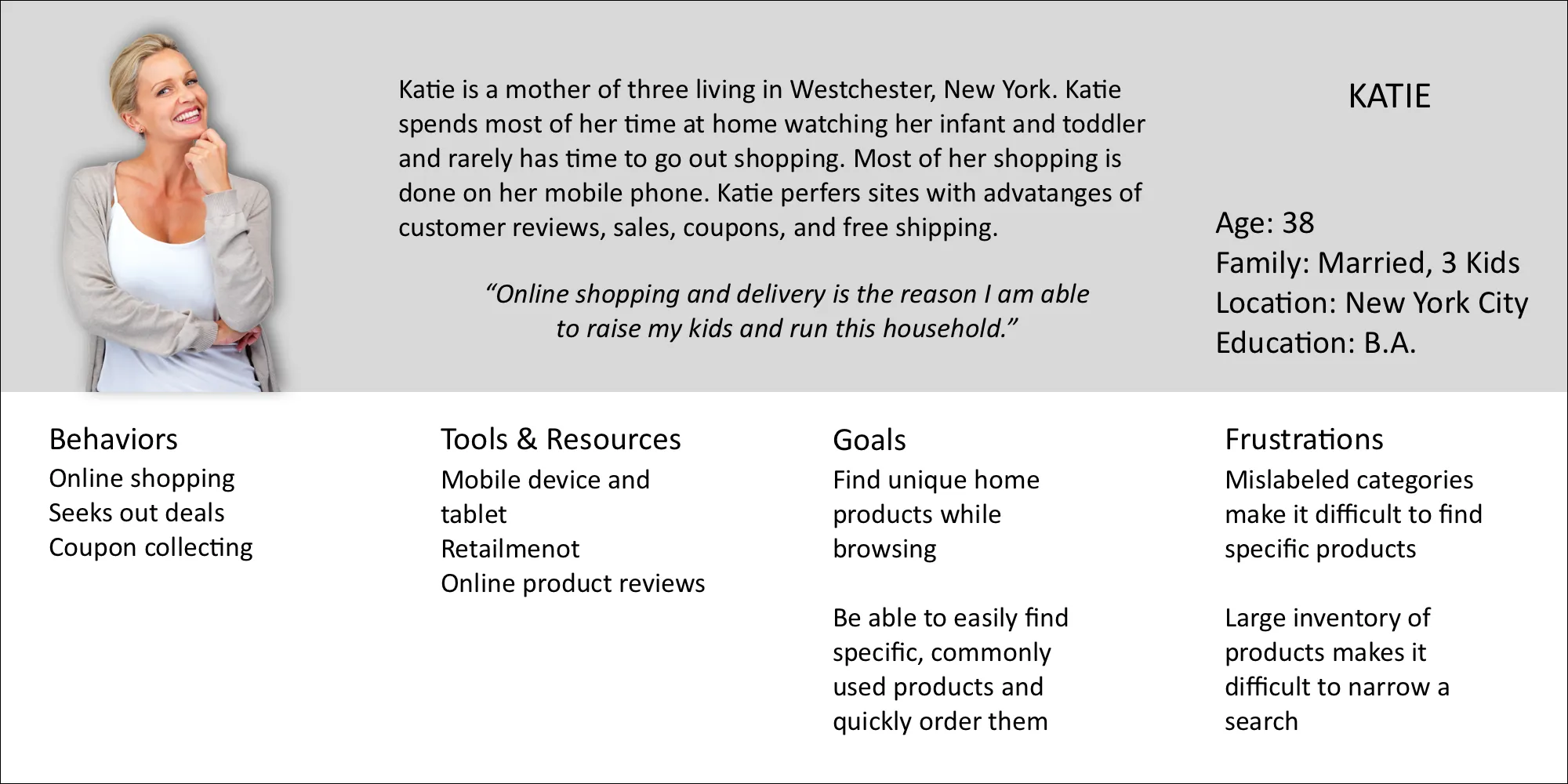
Defining users
Identifying problems
Current site navigation
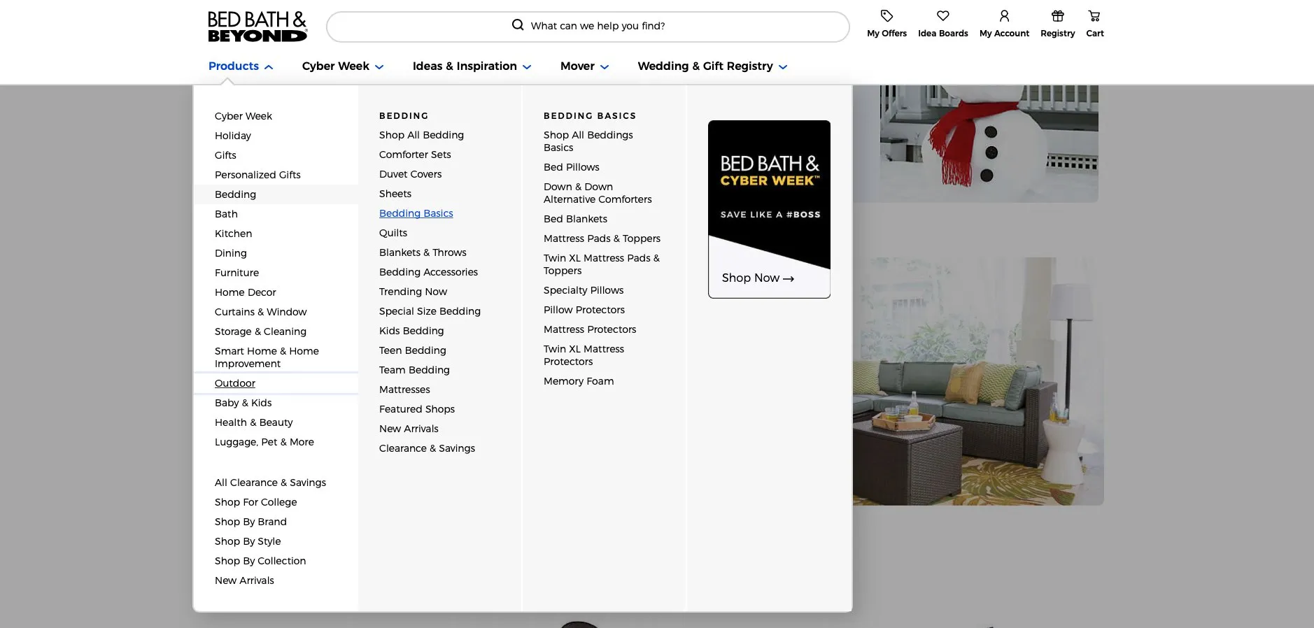
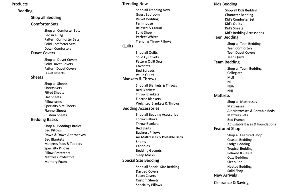
Current site map
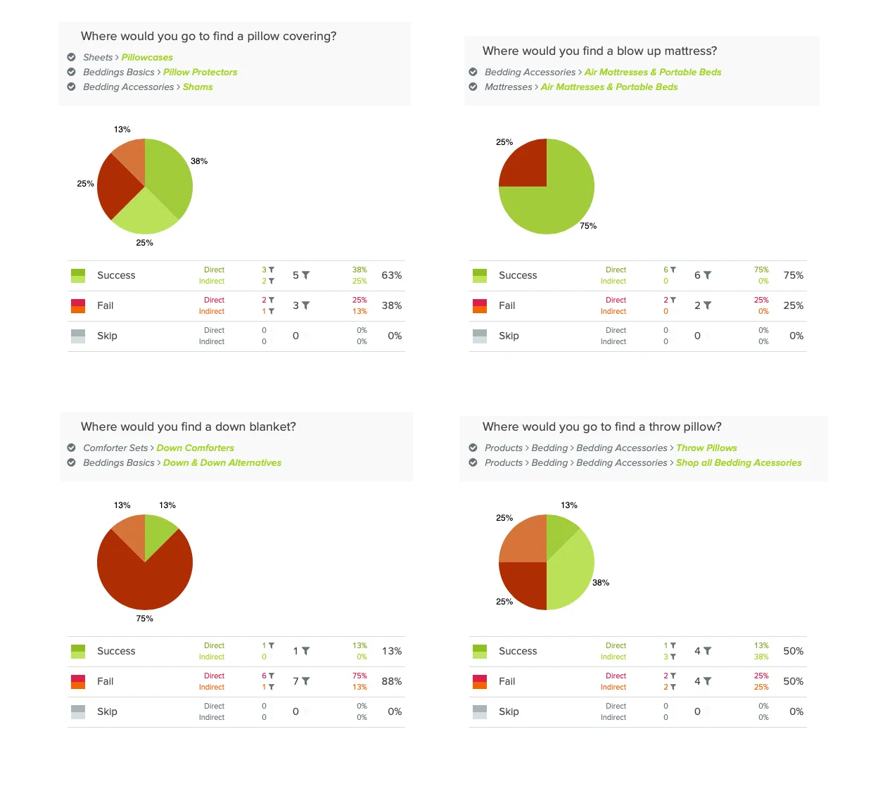
Tree test
8 participants completed 4 tasks:
- Where would you go to find a pillow covering?
- Where would you find a blow up mattress?
- Where would you find a down blanket?
- Where would you go to find a throw pillow?
Open card sort
4 participants sorted 85 labeled cards into groups and named the groups they created.
Problems & possible solutions
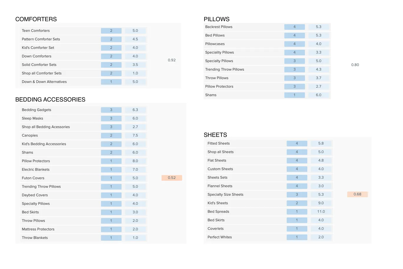
Duplicate labels. Items appeared in more than one category. Duplicates should be combined and placed in the best-fitting category.
Too many categories. The bedding category had 17 subcategories, while participants created an average of 9. Combining similar ones, like Kids and Teens, makes the menu feel less overwhelming.
Initial ideas
Based on the testing, I redesigned the information architecture of the bedding category.
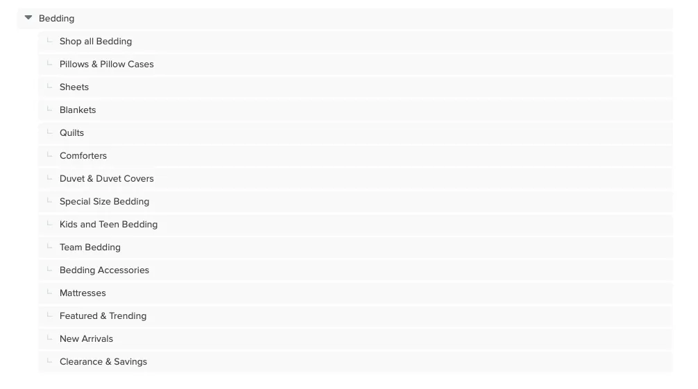
- Created a Pillows & Pillowcases category
- Combined Kids and Teen into Kids & Teens
- Combined Trending and Featured into Featured & Trending
Testing ideas
I tested the new structure with a tree test like the one I ran on the current site. 5 participants completed these tasks:
- Where would you go to find a pillow protector?
- Where would you find a blow up portable bed?
- Where would you find a down or down alternative bed covering?
- Where would you go to find a throw pillow?
- Where would you find a bed skirt?
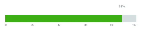
Success
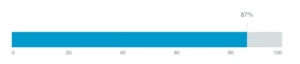
Directness

Task success
Information & visual design
Site map
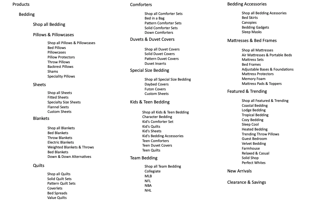
Navigation
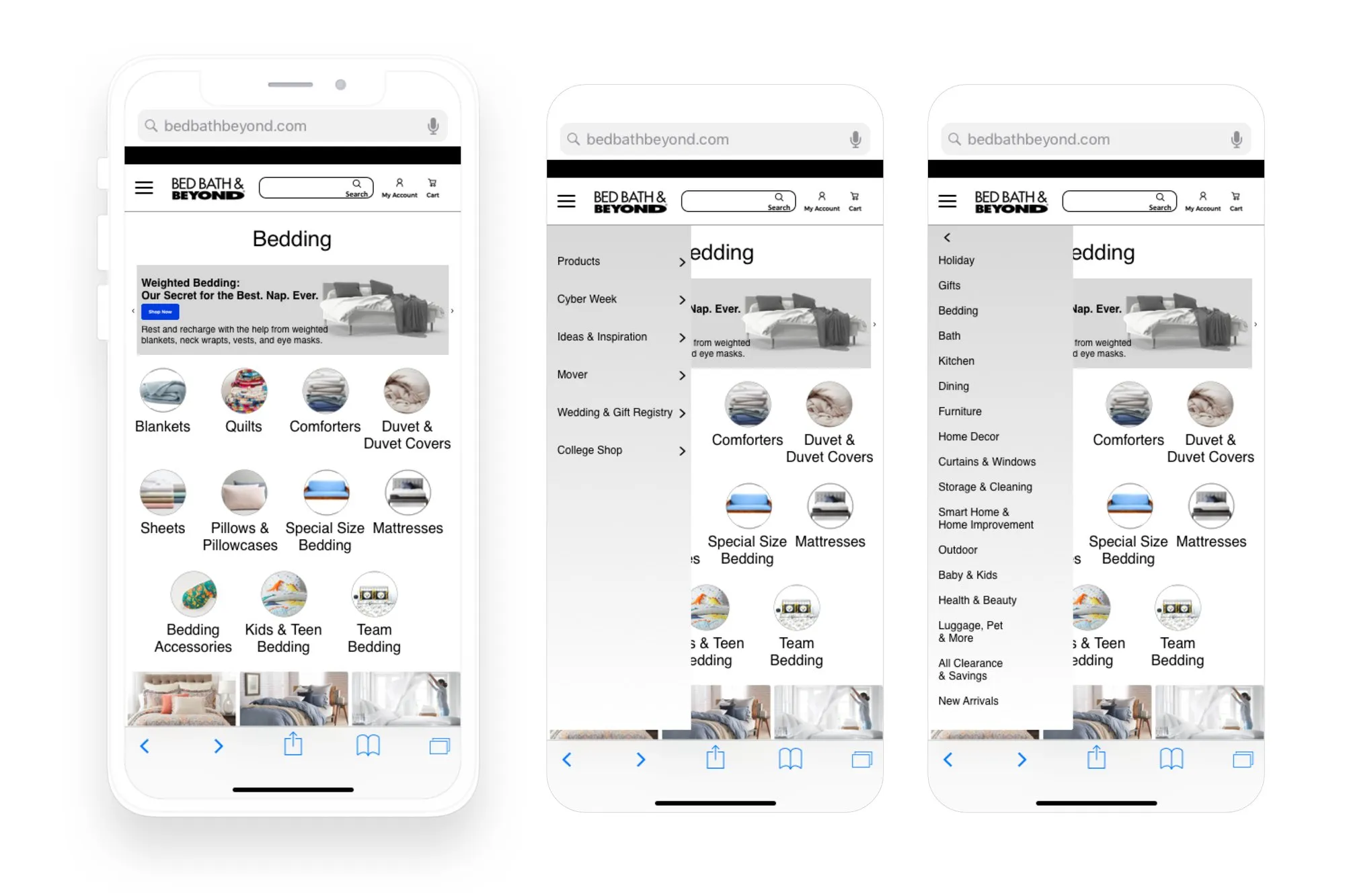
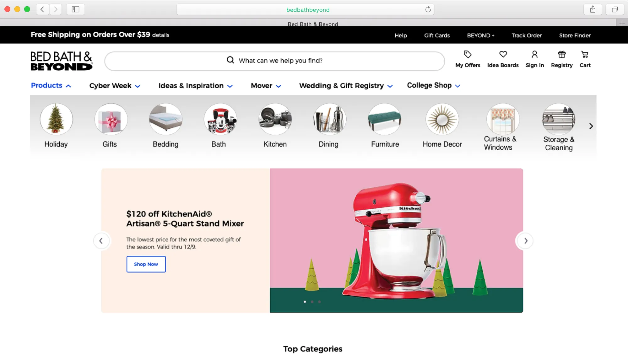
I prototyped the global navigation and products menu in Origami Studio. The drop-down menu stays open until the user clicks Products again, so people can browse the long list at their own pace without it disappearing. Pictures next to each label help shoppers pick a category faster and make unfamiliar terms clear.
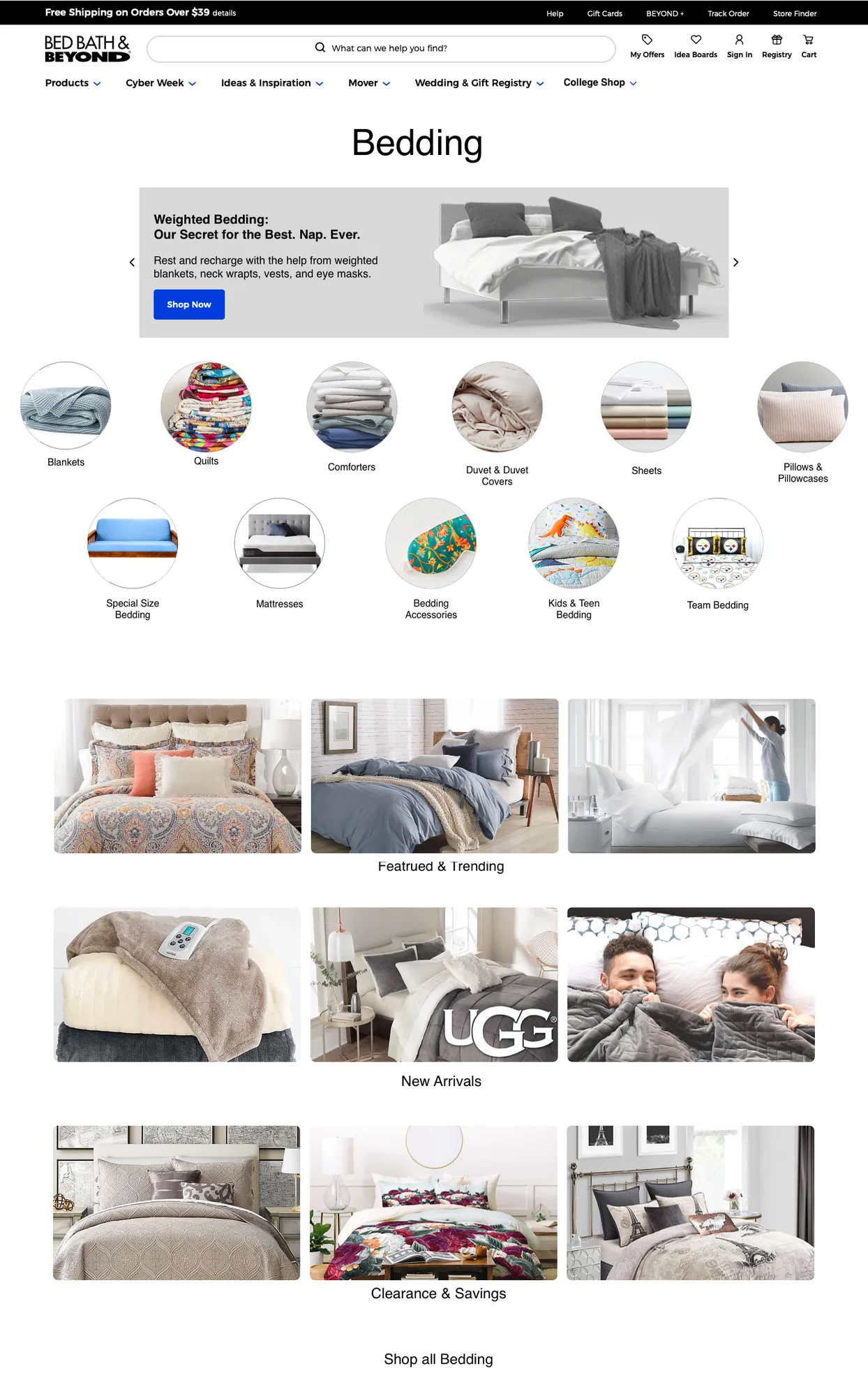
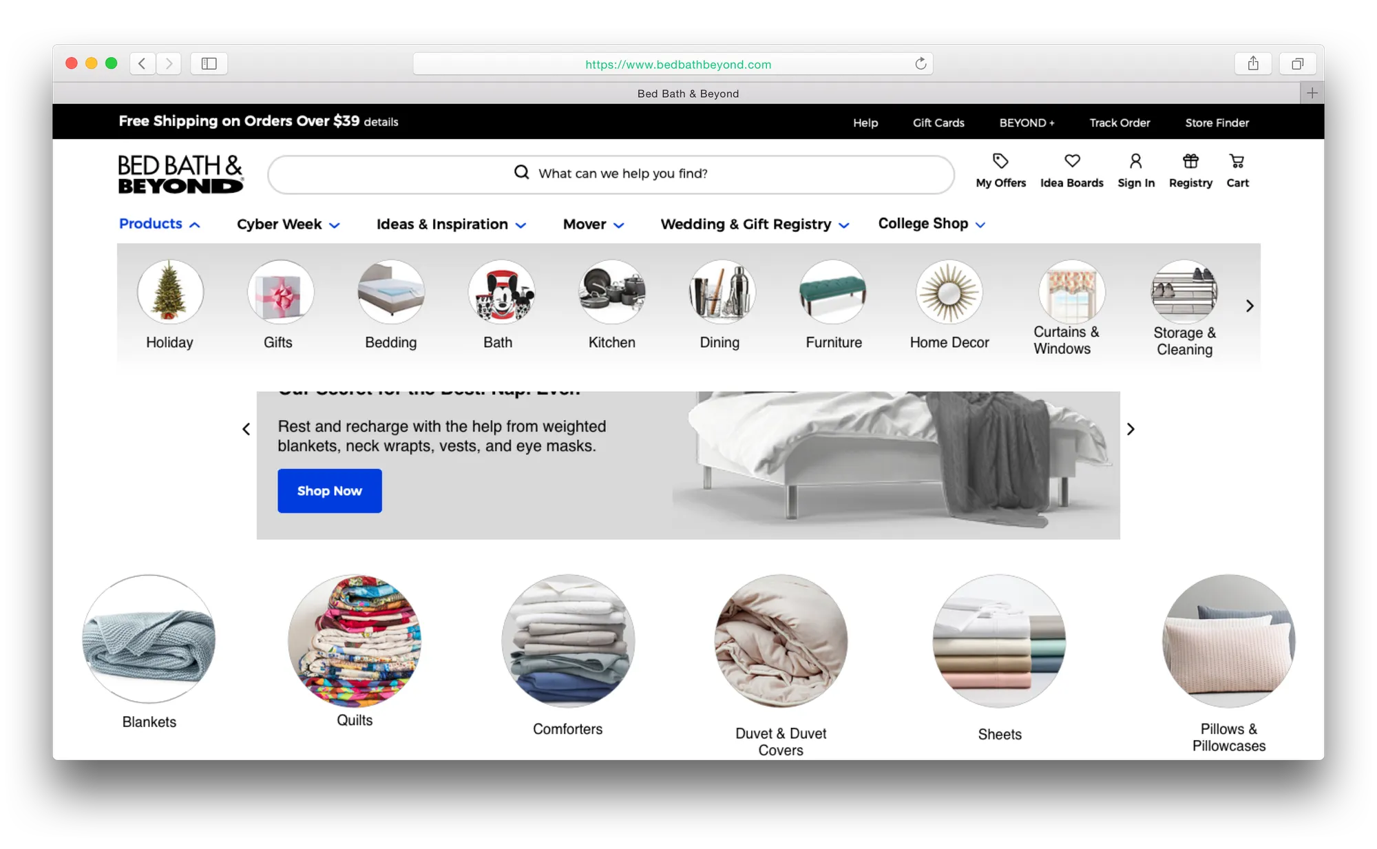
On the bedding page, a visual navigation matches the products menu so shoppers can see every category at once without hovering or scrolling. Categories that change often (Featured & Trending, New Arrivals, Clearance & Savings) get full-width images to draw people in.
Final product